
Aug 9
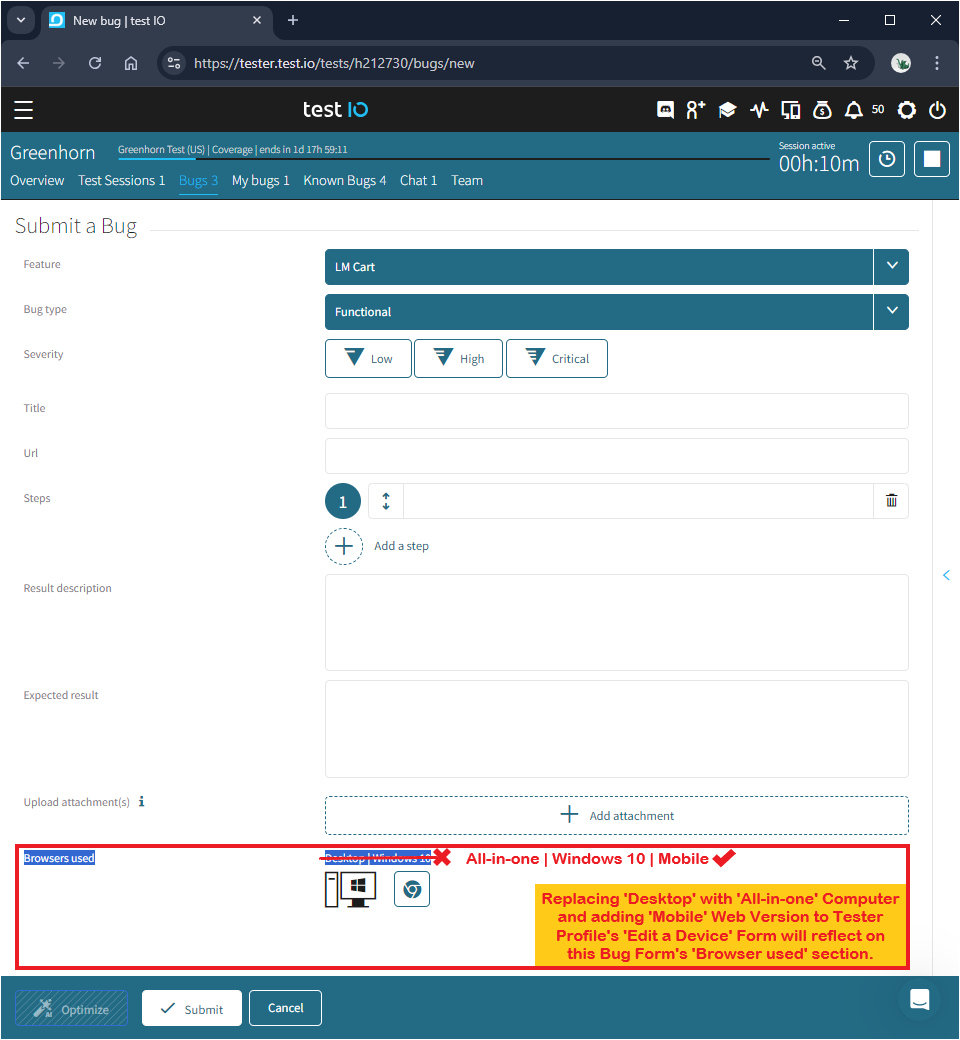
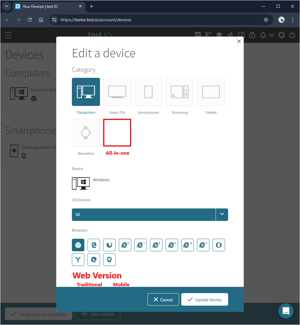
Add 'All-in-one' under 'Edit a device'/'Browsers used' and add 'Mobile'/'Traditional' under 'Web Version' on future Bug Form template and Tester Profile device database
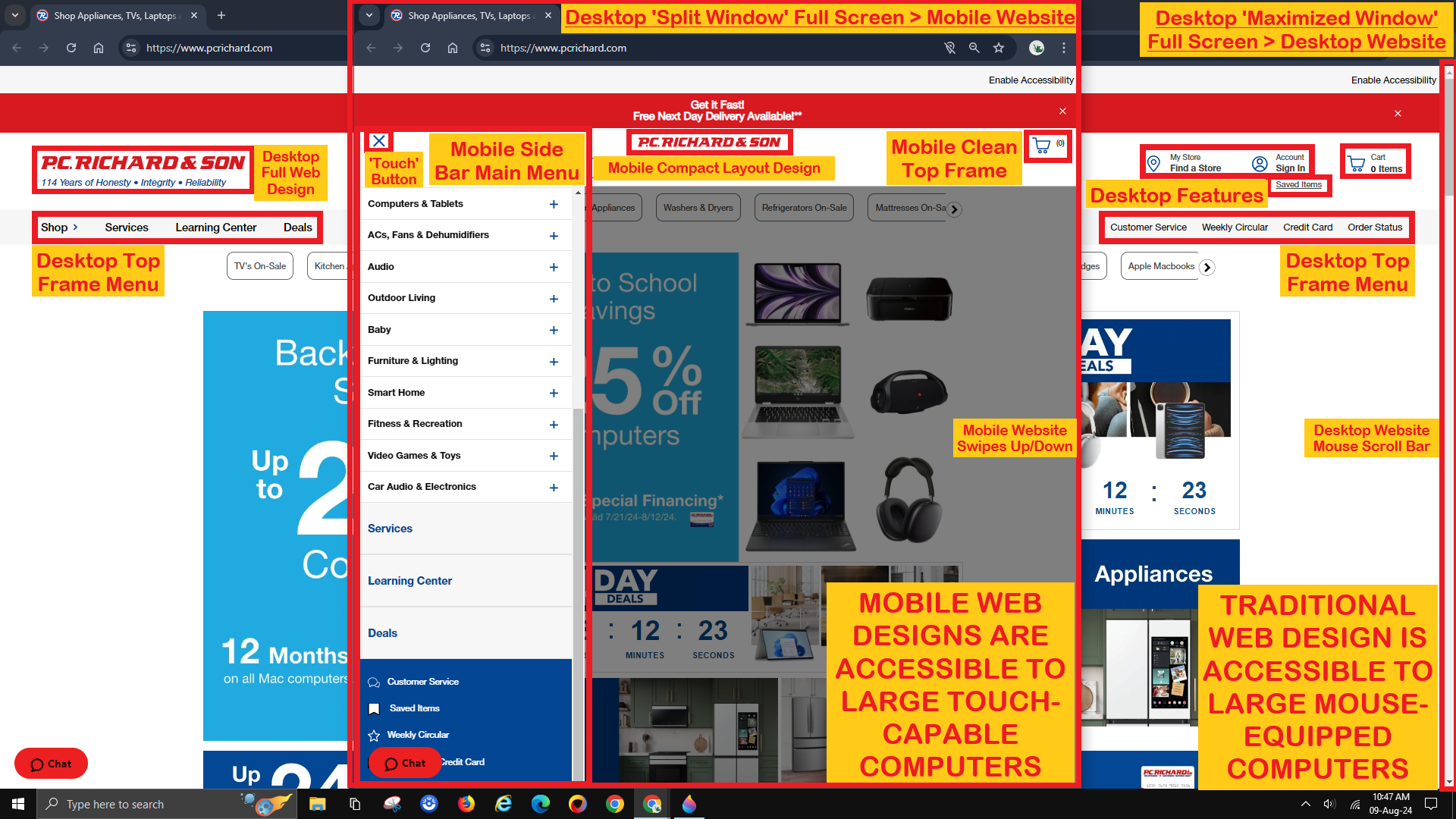
Please allow testers with large touch-screen All-in-one Desktop Computers the option to test Mobile Websites that are uniquely accessible through their default Split Screen feature.
After all, the Academy supports testing in combination with other features to spot differences.
Screen-splitting the browser window of a fully-maximized Traditional Website down to its typical half size will make it behave like a normal Full Screen Mobile Website.
A long-established Traditional Website may require more time to bug hunt when it is less likely to contain bugs than their newer unidentical-twin Mobile Version.
Accessing a Mobile Website through a touch-capable Desktop Computer and testing it with a mouse is much easier than through a touch-exclusive Smartphone, the latter which requires additional screenshots of its time/date.
Mobile Web Designs tend to function identically and consistently on both Computers and Mobile Devices, so any bugs found through a Split Screen are real, not forced.
This workaround using an All-in-one Computer feature can boost the ability to report the bugs encountered by Smartphone and Tablet users, which would interest many of our customers with Mobile products.
Closed
Hello M, thank you for your suggestion. At this time, this type of device is not relevant for our customers, as we have not received any requests for it. For this reason, we do not currently plan to add it to the list of available devices. However, should customer demand arise in the future, we will certainly consider adding this device so that testers can also perform testing on all-in-one devices. Thank you for helping us make our platform better.